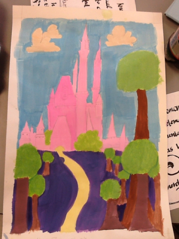

This is my Disney landscape I painting. I drew a princess castle with trees in front of it and a nice blue sky behind the castle. I chose a light pink color for the castle to make it look like a princess castle and innocent. And for the grass I chose a dark purple to contrast the castle and the sky.
0 Comments
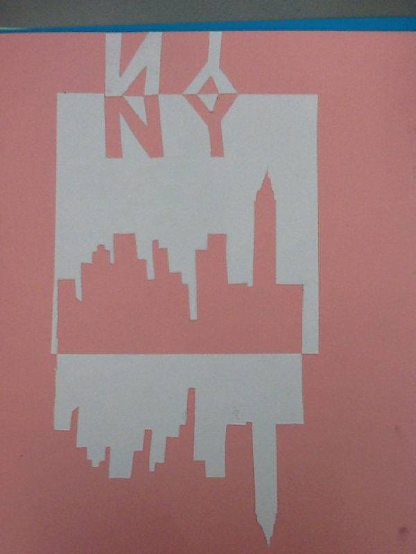
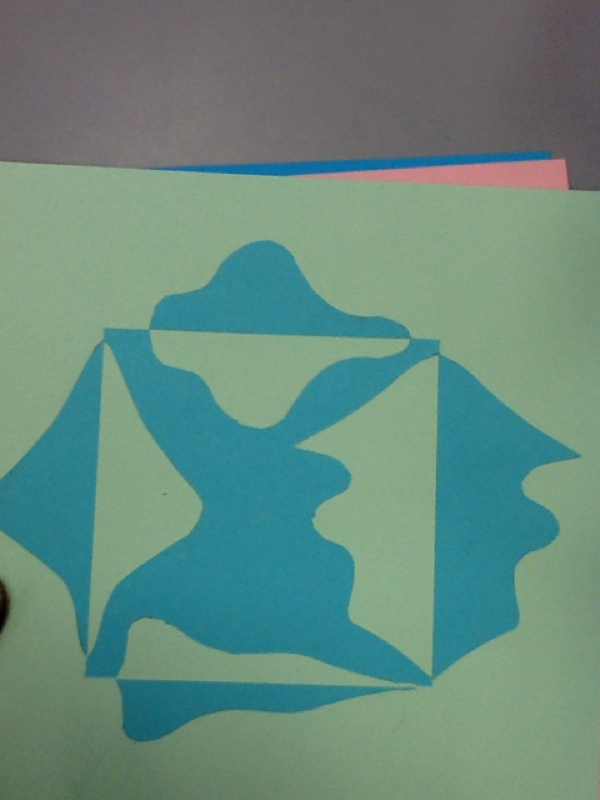
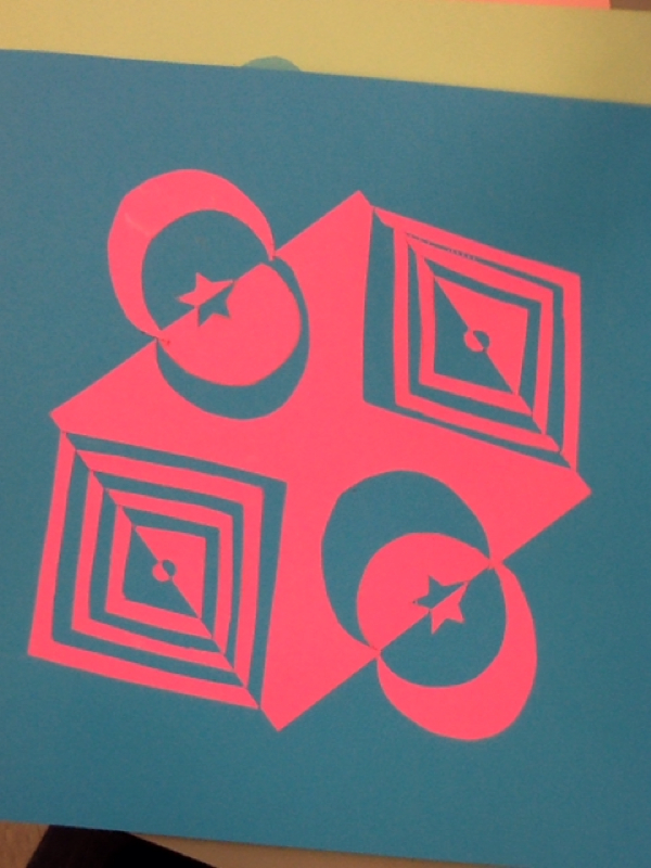
This is my narrative notan project. The two colors I chose were white and a light pink. They don't. Really contrast the colors are actually complete opposites. The design of this project was a narrative of New York and straight lines. This is my asemetrical notan project. The two colors I chose were a mint green and a light blue. The colors kind of match each so there's not much contrast on the design. The relationship between the colors are analogous. And the design of this project was asemetrical with curves. This is my symmetrical notan project. I chose neon pink and blue as my two colors, they interact with each other by contrast. The pink contrasts on blue very well. They compliments each by showing the colors at their brightest. The main design of this was symmetrical with straight edges and curves. |
 RSS Feed